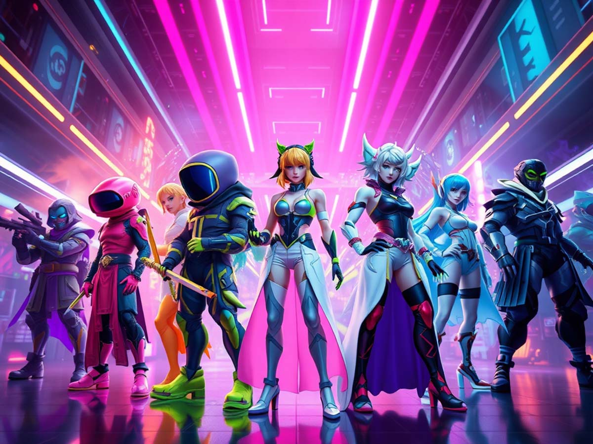
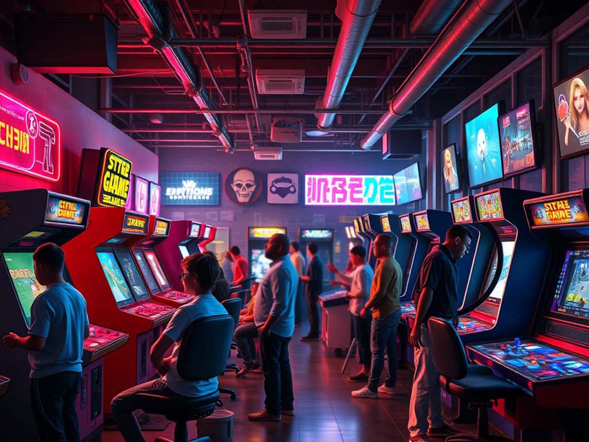
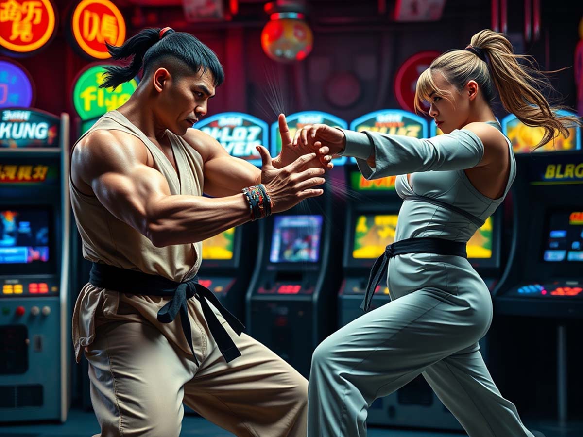
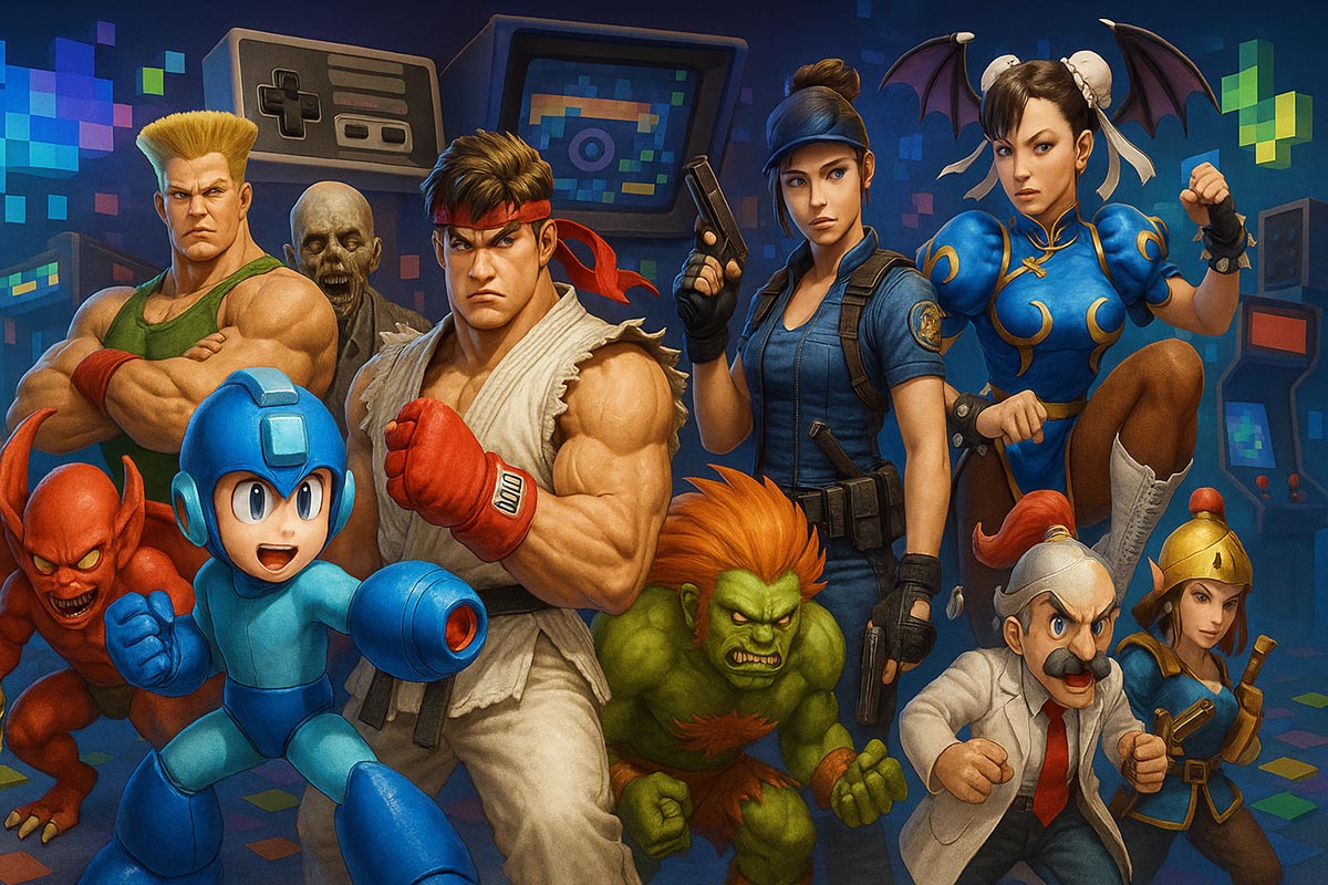
Gaming has always been more than just a pastime. It brings people together, fuels creativity, and tells unforgettable stories. The beauty of gaming lies not only in the mechanics but also in how color enhances these virtual adventures. Vibrant worlds, striking visuals, and artistic design turn simple gameplay into a breathtaking experience.
From pixelated classics to modern, high-definition masterpieces, color plays a crucial role in shaping emotions, guiding players, and making each journey more immersive. Understanding how artistic design influences gaming can help players, developers, and enthusiasts appreciate the depth of this interactive art form.
How Color Impacts Storytelling
A game’s color palette isn’t chosen randomly—it’s a deliberate decision that shapes the player’s journey. Color conveys emotion, sets the mood, and even influences gameplay.
Setting the Mood
Dark, muted tones often signal danger, mystery, or suspense. This is why horror games rely on shadows, deep blues, and desaturated environments to create an eerie atmosphere. On the other hand, adventure and fantasy games often use lush greens, bright blues, and golden hues to evoke warmth and excitement.
Imagine playing a survival horror game with pastel colors. The fear factor would be significantly reduced. Color dictates the emotional response of players, making each scene feel more intense, joyful, or mysterious.
Guiding the Player
Developers use color as a tool to subtly direct players. Important objects, pathways, or interactive elements often stand out with distinct hues that contrast with the environment. In platformers, for example, ledges or climbable surfaces are frequently highlighted with bright tones, ensuring players instinctively know where to go.
Games like Mirror’s Edge use a technique called “color scripting,” where red is used to guide players toward their next objective. This eliminates the need for excessive on-screen markers and allows for a more immersive experience.
Eliciting Emotions
Each color elicits different emotions, affecting how players perceive a game’s world. Cool colors like blue and green create a sense of calmness and stability, which is why many open-world games use them in their landscapes. Meanwhile, red and orange invoke urgency and excitement, often appearing in combat-heavy scenarios.
Games like Journey use a warm color palette to create a sense of discovery and wonder, making the experience feel more emotionally engaging.
Iconic Color Schemes in Gaming
Some of the most beloved titles stand out because of their distinct use of color. Whether it’s a minimalist approach or a bold explosion of hues, these choices leave a lasting impression.
Recognizable Worlds and Their Color Influence
- The Legend of Zelda: Breath of the Wild – Soft pastels and natural hues create a tranquil yet adventurous setting.
- Cyberpunk 2077 – Neon blues and pinks immerse players in a futuristic, high-energy environment.
- Hollow Knight – A muted palette with strong contrasts enhances the eerie, mysterious tone.
Each of these games crafts an emotional experience that would feel vastly different with another color scheme.
Evolution of Color in Game Development
The gaming industry has come a long way from the limited palettes of early consoles. Today, advanced graphics engines allow developers to experiment with lighting, shading, and dynamic color shifts that adapt to player choices and real-time events.
8-bit and 16-bit Eras
Early video games relied on simple, bright colors to compensate for hardware limitations. The original Super Mario Bros. used a vibrant mix of red, blue, and green, creating a visually engaging world despite graphical constraints. These early color choices became iconic, shaping the identity of gaming as a whole.
The Rise of 3D Graphics
As gaming transitioned into 3D, color palettes shifted toward more muted tones. This change was largely due to technical restrictions, as early 3D models and textures struggled to maintain vibrancy without appearing artificial. Games like GoldenEye 007 and Tomb Raider opted for earthy hues to enhance realism, but at times, this resulted in visually dull environments.
Modern Graphics and Color Dynamics
With modern gaming technology, developers now have the freedom to create hyper-realistic environments with dynamic lighting and shading. Real-time color changes in response to player actions or weather effects bring worlds to life. Games like Red Dead Redemption 2 showcase stunning sunrises, atmospheric fog, and rich seasonal shifts, making color an integral part of the experience.
Color as a Functional Element
Beyond aesthetics, color plays a functional role in many games. Developers use it to communicate vital information without overwhelming players with text or complex mechanics.
Health and Danger Indicators
A common gaming convention is the use of red to indicate danger or low health. Many games feature a screen that flashes red when a character is injured, triggering an instinctive response to seek cover or healing items. Green, by contrast, is often associated with health restoration and safety.
Puzzle Mechanics and Color Coding
Many games incorporate color-coded puzzles to test a player’s perception and logic. Titles like Portal 2 use contrasting blue and orange hues to differentiate between portals, guiding players through challenges without additional explanation.
Similarly, RPGs often use color-coded loot systems—blue for rare items, purple for epic gear—to help players quickly assess an item’s value. This streamlines gameplay while reinforcing a sense of progression.
Visual Recognition in Gaming
Some game elements become synonymous with their colors. The green warp pipes in Super Mario, the blue energy sword in Halo, and the red barrels in many shooter games (which almost always explode) all create a sense of familiarity. Color-coded elements enhance player recognition, making interactions feel more intuitive.
How Developers Use Color to Build Immersive Worlds
For aspiring game designers, understanding color theory can help shape a game’s identity. Choosing the right palette can define a game’s atmosphere, mechanics, and storytelling elements.
Defining the Game’s Tone
The choice of color must align with the game’s narrative. A post-apocalyptic survival game benefits from desaturated, earthy tones to emphasize decay, while a fantasy RPG thrives on rich, saturated colors to highlight magic and wonder.
Maintaining Visual Clarity
Balancing color contrast is key to keeping a game visually appealing and easy to navigate. Overloading the screen with too many similar shades can cause confusion, while carefully planned contrasts make important elements stand out.
Directing Player Attention
Strategic color placement helps guide players through complex environments. Brightly colored objects, glowing pathways, or color-coded NPCs ensure players know where to focus their attention without needing additional prompts.
A Lasting Impression
The artistic choices behind a game’s color scheme influence more than just its appearance. They shape the entire experience, from storytelling to gameplay. Whether exploring the rolling green fields of an open-world RPG or navigating neon-lit cityscapes, color breathes life into digital adventures.
Gaming is an art form, and color is one of its most powerful tools. Next time you play, take a moment to appreciate the thought and creativity behind every shade and hue—it might just change the way you see your favorite titles.


